Walkers Style
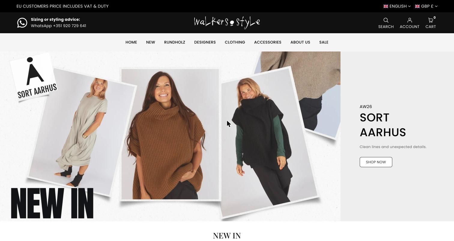
A boutique that has traded since 1990, now run from Lagos, Portugal. The site is warm and direct: a hand-drawn wordmark, collage-style campaign slides, and real customers and staff in the photography.
Type system.
Typeface names and sizes read from the live site. These are free Google Fonts, so the specimens are set in the real typefaces.
Palette.
Sections, top to bottom.
Notice bar
Tax and duty message on the left, language and currency on the right.
Header
WhatsApp styling advice, the hand-drawn wordmark centred, search, account and cart. Navigation sits on a pale strip below.
Campaign slider
A collage image with a grey text panel: season, designer name, one line, one button.
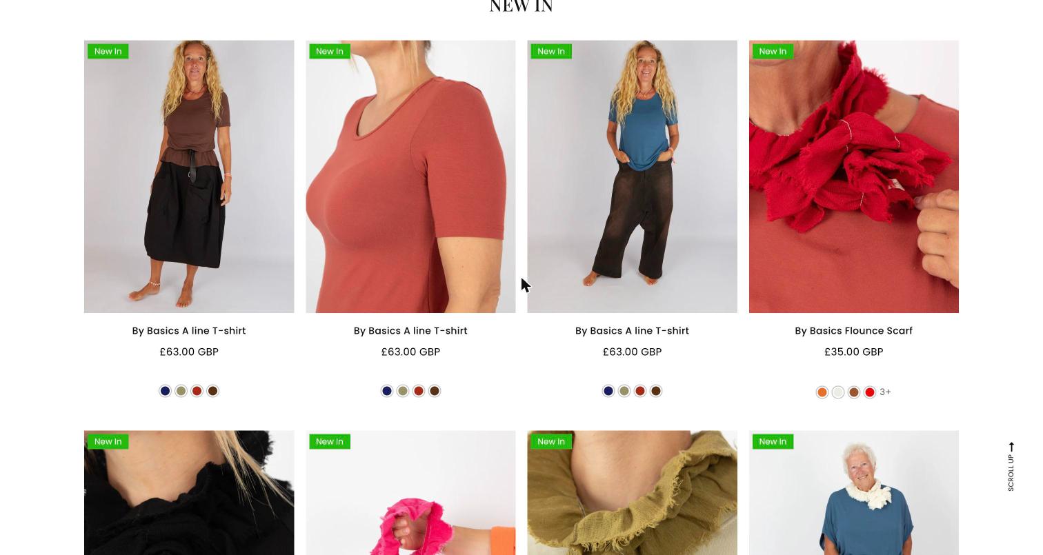
New In
Two rows of four products with a green badge, price and colour dots.
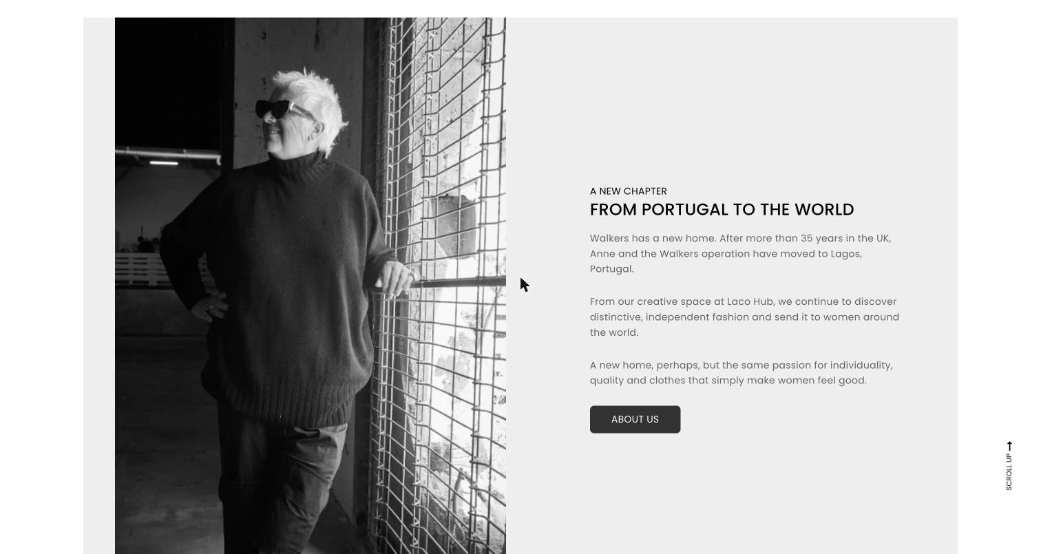
From Portugal to the world
A black-and-white portrait beside the story of the move to Lagos.
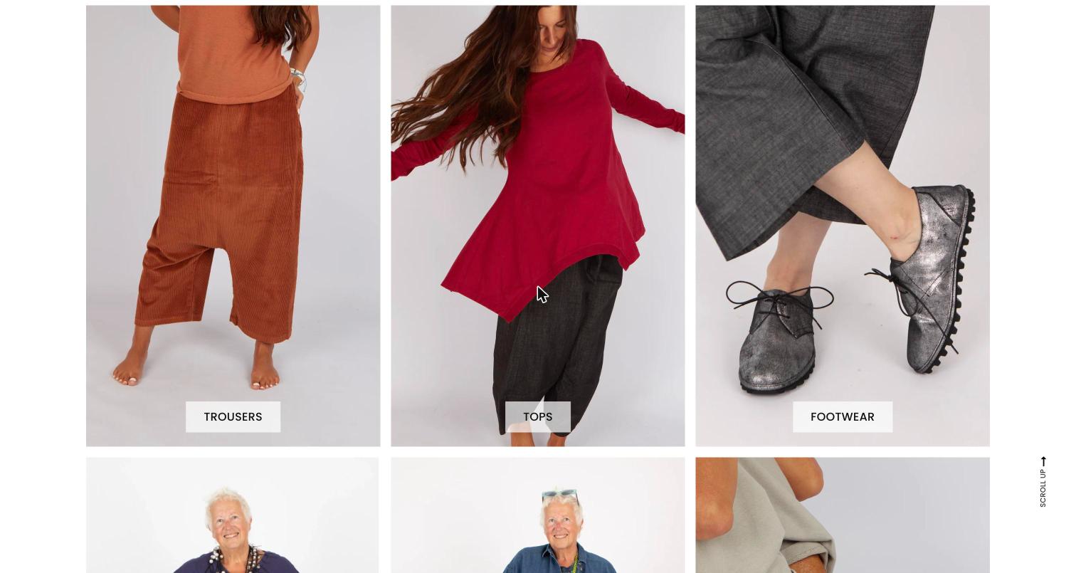
Shop by category
Tall image tiles with a label set on a pale tab.
Gift card and footer
A featured gift card, then information links.
What makes it work.
- The wordmark is hand-drawn, which sets the tone before anything else loads.
- The models are real women of different ages, not agency models. It matches who the shop sells to.
- A serif for titles and a rounded sans for everything else keeps a large catalogue easy to scan.
- The only strong colour in the interface is the green “New In” badge.