Selected work
Mejuri
SectorFine jewellery
TypeE-commerce storefront
PlatformNot identified
Sitemejuri.com/gb/en
Overview
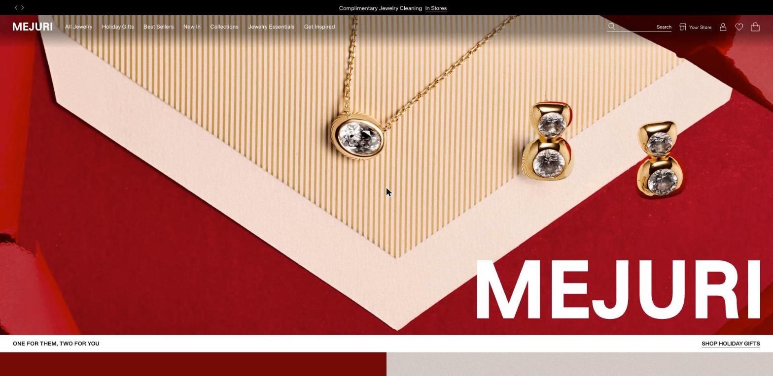
Bold and graphic for a jeweller: wide-tracked capitals, a typewriter face for the voice, and blocks of deep red against macro product shots.
Typography
Type system.
Headlines
Syndicat GroteskMedium weight, uppercase, widely tracked: 64px with 3.2px tracking for the lead, 32px with 1.6px for sections.
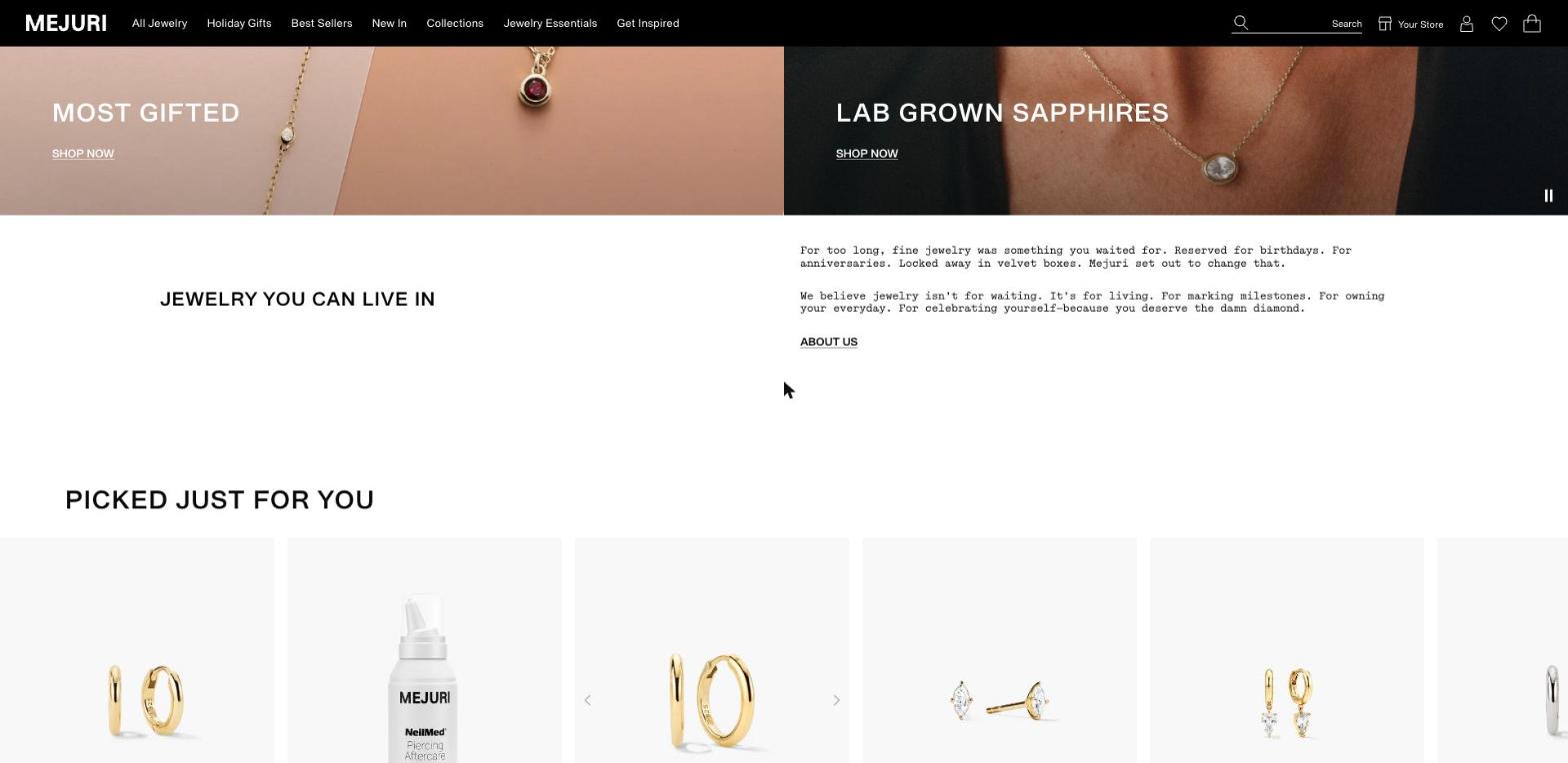
MOST GIFTED
Voice
Simon MonoMonospaced body copy for brand statements and product blurbs.
Jewelry isn’t for waiting.
Interface
Syndicat GroteskNavigation 14px regular; actions 14px medium, uppercase, underlined.
SHOP NOW ABOUT US
Typeface names and sizes read from the live site. Specimens are set in a similar system font, because the brand’s own fonts are licensed.
Colour
Palette.
#000000Black — header, type
#ffffffWhite — page
#760a07Oxblood — campaign blocks
#f8f8f8Mist — product tiles
Layout
Sections, top to bottom.
01
Announcement bar
A black strip with arrows to cycle messages.
02
Campaign hero
Full-bleed still life with the wordmark set very large in the corner.
03
Message strip
A one-line offer on the left, an underlined action on the right.
04
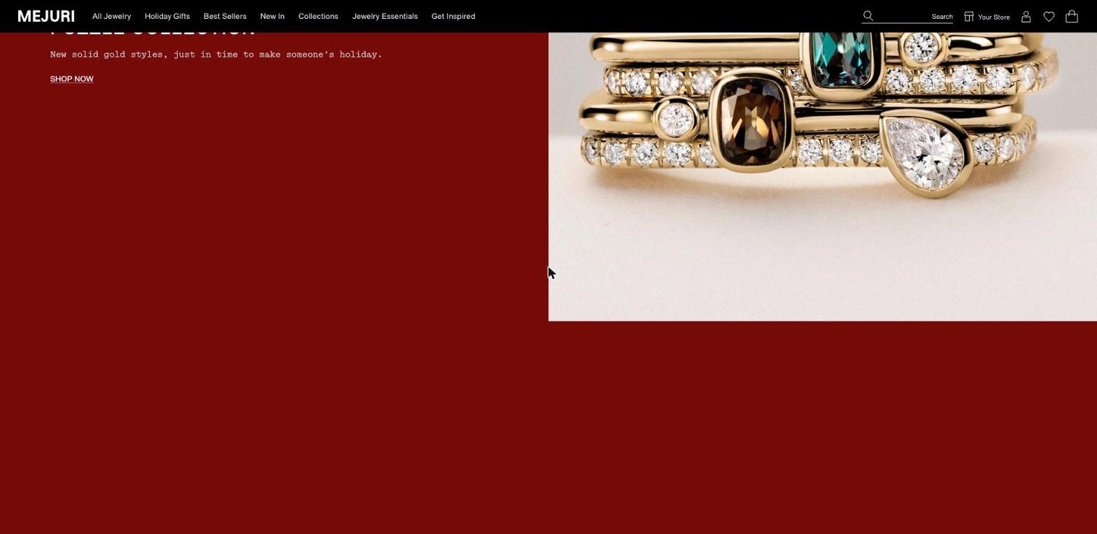
Half and half
A flat oxblood panel with copy beside a macro product photograph.
05
Two-up banners
Paired collection images with a title and underlined link.
06
Brand statement
Heading on the left, two short paragraphs in mono on the right.
07
Product rail
A horizontal row of pale tiles with arrows.
Style
What makes it work.
- Mixing a grotesk with a typewriter face gives a luxury product a plain-spoken tone.
- Actions are underlined capitals, never filled buttons.
- Large flat colour fields give the photography room and make the page feel like a printed campaign.
Next projectWalkers Style
↗