House of Decant
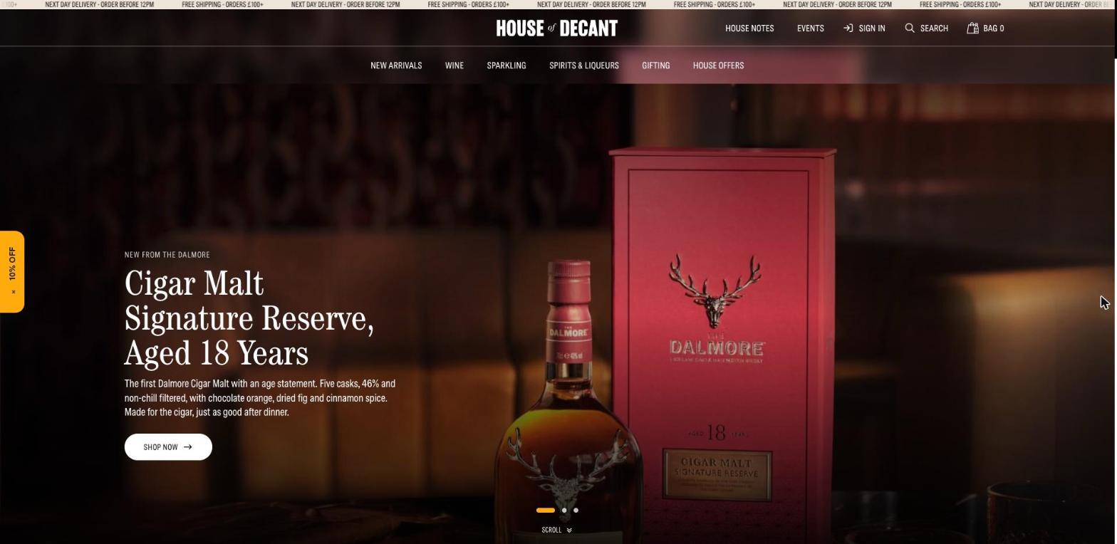
A drinks shop dressed as a members’ club: dark, warm photography up top, then a calm cream shop floor where the bottles do the talking.
Type system.
Typeface names and sizes read from the live site. Specimens are set in a similar system font, because the brand’s own fonts are licensed.
Palette.
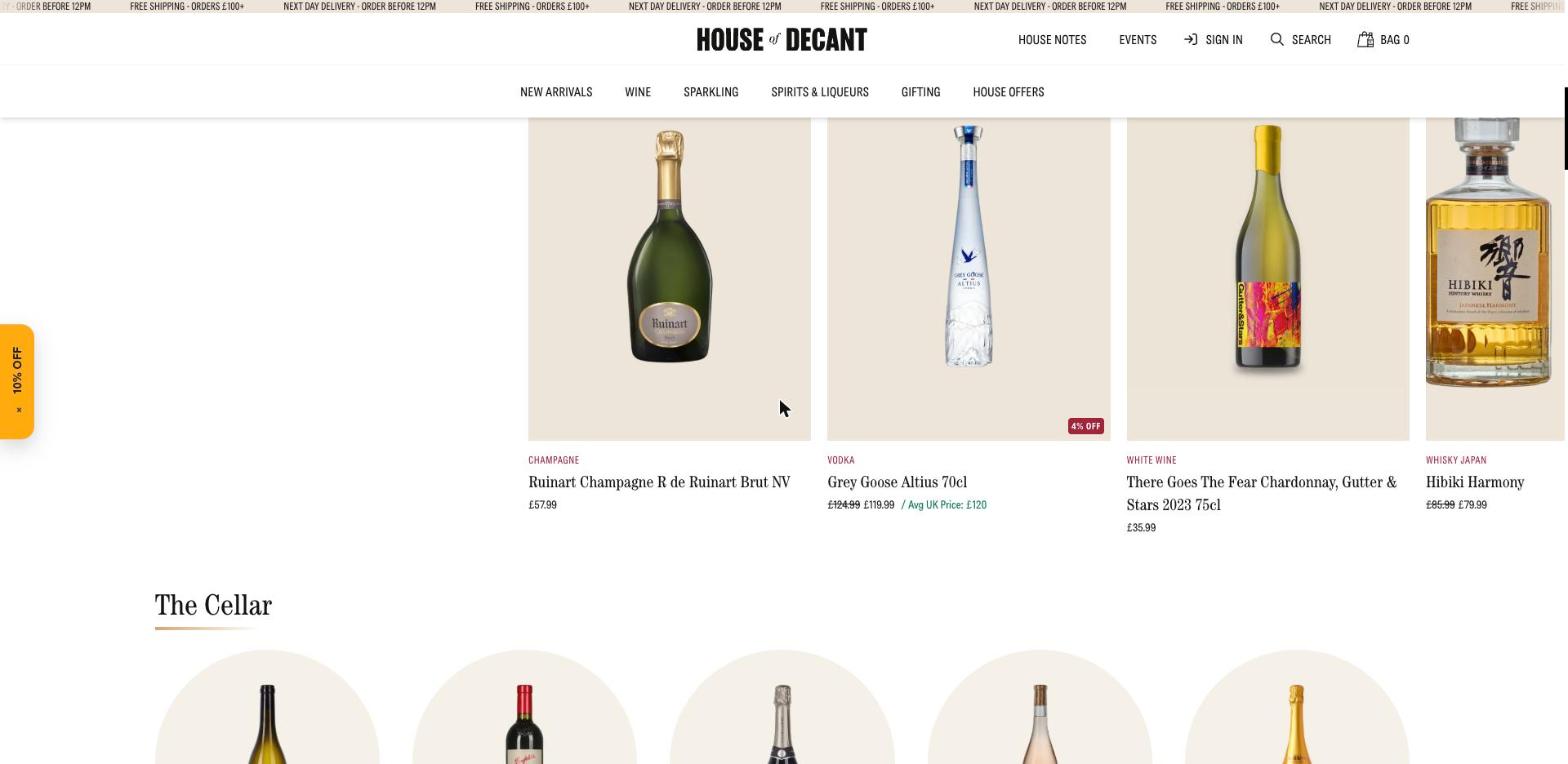
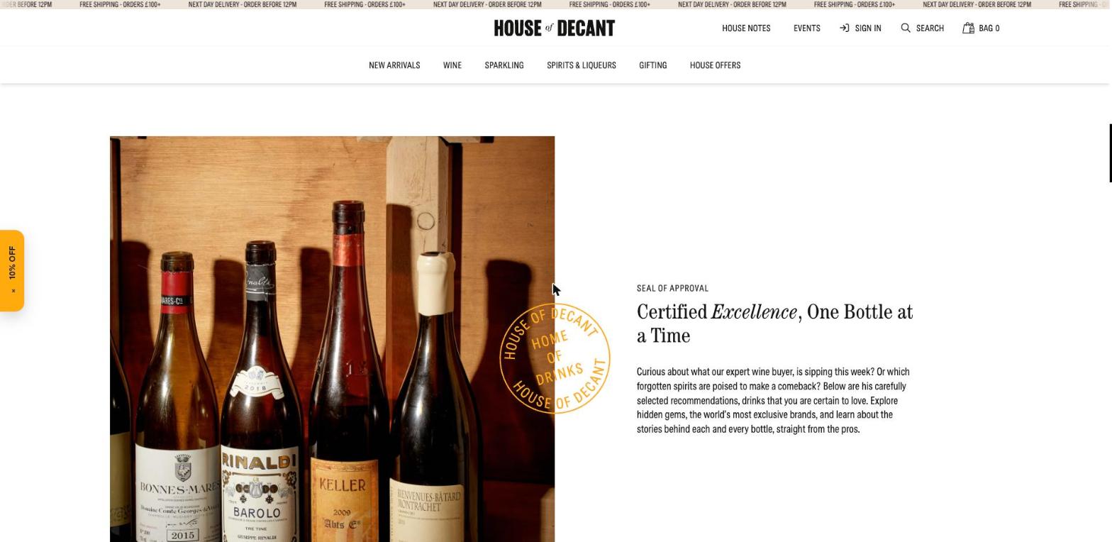
Sections, top to bottom.
Ticker
Delivery messages scroll across the very top in small capitals.
Two-tier header
Wordmark centred, account tools on the right, categories on a second row.
Hero carousel
Full-bleed photograph, small label, three-line serif headline, one pill button.
Product rails
Parchment tiles with a coloured category label, serif name, price and a market comparison in green.
The Cellar
Categories as circular tiles under a short gold rule.
Seal of approval
Editorial photo and text, overlapped by a round amber stamp.
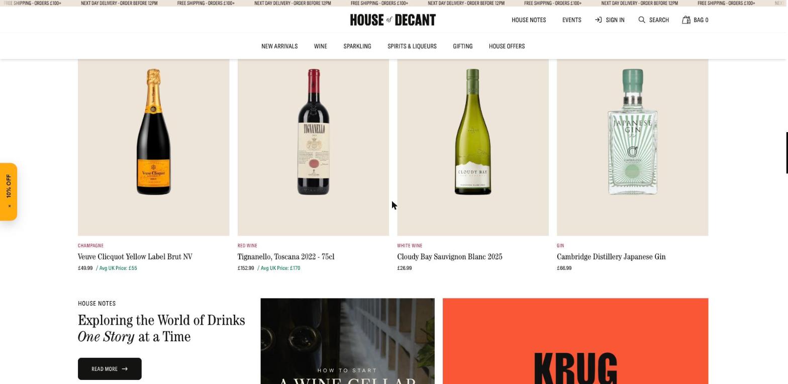
House Notes
Journal cards mixing photography with flat colour blocks.
What makes it work.
- Serif for anything you would read aloud, condensed sans for anything you would click.
- One accent, amber, reserved for the seal and the offer tab.
- The dark hero and the pale shop are joined by the same warm undertone, so the switch feels deliberate.